China Top 10 Paper Flower Colors for Corporate Branding?

Time:2026-10-13 Author:Mason
0%

China Top 10 Paper Flower Colors for Corporate Branding explores how color choices shape brand perception in offices, exhibitions, hotels, and retail spaces. Paper flowers are more than decorative objects. A deep blue flower wall can suggest trust in a technology showroom, while warm terracotta may create a more human feeling in a lifestyle brand display. According to the Pantone Color Institute’s trend reports, color reflects changing consumer moods, cultural expectations, and visual communication habits. However, trend popularity should not replace brand strategy.

How to match paper flower colors with corporate branding? Begin with the company’s logo, audience, industry, and physical environment. Euromonitor International’s Voice of the Consumer: Sustainability Survey 2024 highlights growing consumer attention toward responsible materials and purchasing values. Recyclable paper, restrained color combinations, and reusable floral installations can support that expectation. Still, sustainability claims need evidence. A paper flower is not automatically an environmentally responsible product.

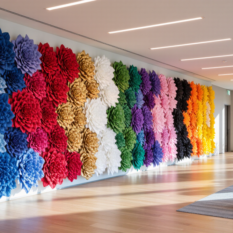
This guide examines ten practical colors for Chinese corporate branding, including blue, red, gold, white, green, purple, pink, orange, black, and yellow. Each color carries different emotional and cultural associations. Red may communicate energy and celebration, yet excessive red can feel aggressive. White appears clean, but may seem empty without texture or contrast. The ranking is useful, not absolute. Regional preferences, lighting, printing quality, and screen differences can change the result. Readers should test small samples beside the actual logo and wall surface. A beautiful palette can still fail in a dim lobby. That part is easy to overlook.

China Top 10 Paper Flower Colors for Corporate Branding?

What Makes Paper Flower Colors Effective for Corporate Branding

Paper flower colors become effective corporate branding tools when they connect emotion with clear visual recognition. In China, white, ivory, red, orange, yellow, green, blue, purple, pink, and black offer varied communication possibilities. However, color meaning changes across industries, audiences, and occasions. Context changes everything.

Blue can suggest stability, while green often supports environmental or health-related messages. Red creates energy and visibility, but excessive use may feel aggressive. Ivory and white make paper flowers appear clean, refined, and spacious. Orange and yellow attract attention in welcoming displays. Purple can communicate creativity, although it may appear less formal under warm lighting. Pink adds softness, but its use requires careful audience research.

My experience with event decoration shows that material changes color perception. Folded paper creates shadows, layered petals deepen dark shades, and glossy surfaces reflect nearby lights. A color that looks balanced on a screen may feel too bright on a stage. Small sample arrangements should be tested beside signage, furniture, and photographic backgrounds. Contrast also matters; pale flowers can disappear against light walls. Designers should record lighting conditions and viewing distance before approving a palette. Yet no palette is universally right. Some combinations look attractive but fail to support the intended message. That mistake is easy to make. A reliable process combines cultural awareness, accessibility checks, physical testing, and feedback from the target audience. Conservative choices are not always safer. Sometimes a restrained accent color creates stronger recognition than a crowded arrangement.

The Top 10 Paper Flower Colors and Their Brand Associations

Paper flower color can shape how a corporate space feels before visitors read a single message. In event styling, I have seen color influence attention, mood, and perceived professionalism. White suggests clarity, trust, and clean communication. Blue feels dependable, calm, and organized. Red adds urgency, confidence, and strong visual focus. It can feel loud. Yellow brings optimism, openness, and creative energy, especially near reception desks or interactive displays. Orange communicates movement, warmth, and practical enthusiasm.

Green connects with growth, balance, renewal, and environmental awareness. Its effect changes with the paper texture and lighting. Pink softens formal spaces and can suggest care, approachability, or modern elegance. Purple often represents imagination, expertise, and premium thinking. Dark purple may look serious, while lavender feels more relaxed. These associations are useful, but they are not fixed rules. Cultural expectations and audience age can change the response.

Black gives structure, authority, and visual contrast. It works well as a backdrop or outline for lighter flowers. Gold suggests achievement, quality, and celebration. Metallic paper catches light beautifully, yet too much gold can appear excessive. A balanced palette usually combines one dominant color with one supporting shade. Test paper samples under the actual venue lighting. Small differences matter. My own choices are not always perfect; a color that looked refined on a screen once appeared dull in a large room. Reliable branding needs observation, adjustment, and honest review.

How to Match Paper Flower Colors with Corporate Brand Identities

China Top 10 Paper Flower Colors for Corporate Branding?

How to Match Paper Flower Colors with Corporate Brand Identities

Paper flowers can turn a corporate space into a clear visual statement. The best color choice starts with the brand identity, not personal preference. White and ivory suggest cleanliness, trust, and simplicity. Blue often communicates stability and professionalism. Green supports themes of growth, nature, and responsibility. Red creates energy and confidence, while orange feels active and approachable.

The remaining popular choices include yellow, pink, purple, black, and metallic gold. Yellow can brighten a learning event or creative workspace. Pink may soften a formal reception area. Purple adds imagination and a premium atmosphere. Black gives strong contrast, especially beside white flowers. Gold works well as a restrained accent, not as the main color. Too much gold can look excessive.

Use one dominant shade, one supporting color, and a small accent. Match them with the logo, uniforms, displays, and venue lighting. For example, blue flowers with ivory centers can create a calm registration backdrop. Green and white arrangements suit sustainability conferences. Red flowers may work better in small clusters than across an entire stage.

In my event styling experience, color samples often look different under warm lights. Test them in the actual venue. Paper texture matters, too. Matte petals feel quieter than glossy ones. I have sometimes chosen a color that looked perfect alone but felt wrong beside the furniture. That mistake is useful. A small mock-up can reveal balance, contrast, and emotional tone before production begins.

How to Combine Paper Flower Colors in Professional Displays

China Top 10 Paper Flower Colors for Corporate Branding?

Professional paper flower displays need more than attractive colors. They must support the company’s message, lighting, and audience. White, ivory, blush, coral, red, orange, yellow, green, teal, and navy offer a flexible ten-color foundation. Neutral flowers create clarity, while stronger shades guide attention toward reception desks, product tables, or photo areas.

A reliable combination usually includes one dominant color, one supporting color, and a quiet neutral. For example, navy flowers with ivory and soft yellow can feel established but welcoming. Green, white, and coral suggest freshness without looking too playful. Keep the strongest color below one-third of the display. Too much red may feel urgent. Too much beige may disappear under warm lighting.

Tips: Test a small arrangement beside the actual signage. Check it under office lights and camera flashes. Use matte paper when reflections look distracting. Match flower density to the space, not only the color chart. Leave breathing room between clusters.

Experienced decorators often adjust colors after installation. A shade that looked balanced on screen may appear dull beside gray walls. This is a useful imperfection, not a failure. Measure contrast carefully, especially when visitors need to read nearby text. Avoid placing dark flowers behind dark lettering. Paper texture also matters; folded edges catch light differently from flat petals. A professional display should look intentional from three distances: across the room, at conversation range, and in photographs.

China Top 10 Paper Flower Colors for Corporate Branding? - How to Combine Paper Flower Colors in Professional Displays

Rank Paper Flower Color Hex Value Professional Impression Recommended Pairings Suggested Display Ratio Suitable Display Use
1
Deep Navy
#1F4E79 Trust, stability, authority, and reliability White, warm gray, pale blue, metallic silver 40% focal color Entrance walls, stage backdrops, formal receptions
2
Forest Green
#2E8B57 Growth, sustainability, balance, and natural quality Ivory, kraft brown, beige, muted gold 35% focal color Environmental events, wellness spaces, company foyers
3
Muted Gold
#D4AF37 Achievement, premium quality, celebration, and value Navy, charcoal, cream, deep green 10% accent color Award ceremonies, milestone displays, VIP areas
4
Warm Ivory
#F5F0E6 Clarity, approachability, refinement, and spaciousness Navy, terracotta, sage green, charcoal 45% base color Neutral backdrops, reception desks, product showcases
5
Terracotta
#B85C38 Energy, craftsmanship, warmth, and human connection Ivory, sand, olive green, dark brown 20% accent color Networking lounges, creative presentations, cultural events
6
Sage Green
#708238 Calmness, modern sustainability, and understated confidence White, ivory, terracotta, soft gray 30% supporting color Healthcare, education, sustainability, and seminar areas
7
Slate Violet
#6A5ACD Creativity, innovation, imagination, and distinction White, silver, pale gray, soft lavender 15% accent color Technology forums, design events, innovation showcases
8
Dusty Rose
#C45A7A Empathy, care, optimism, and contemporary elegance Charcoal, ivory, mauve, muted green 15% accent color Community programs, hospitality areas, appreciation events
9
Blue Gray
#607D8B Precision, composure, professionalism, and modernity White, navy, mustard, light gray 35% supporting color Conference rooms, registration zones, business seminars
10
Charcoal
#263238 Strength, focus, sophistication, and visual contrast Ivory, muted gold, dusty rose, copper 10%–20% grounding color Stage edging, signage frames, high-contrast installations

How to Choose the Best Paper Flower Colors for Each Business Event

Choosing paper flower colors for corporate events requires more than matching a logo. Consider the room, audience, lighting, and photographs. Freeman’s 2024 Trends Report found that 91% of attendees value in-person events for connection. Therefore, colors should feel welcoming, not merely decorative.

For conferences, navy, cobalt, and white create a focused, dependable atmosphere. Teal and emerald suit sustainability forums, especially with recycled paper and natural textures. Sage feels calmer for training sessions. Corporate anniversaries can use burgundy, charcoal, and muted gold for depth. Product launches may benefit from coral, bright yellow, or electric blue, but strong colors need restraint. Too much intensity can overwhelm presentation screens.

Test samples under the actual venue lights. Please do this early. Warm lighting can turn white flowers yellow and soften blue into gray. A practical combination is 70% neutral flowers, 20% core color, and 10% accent color. This ratio is not universal; smaller spaces may need less contrast. For event signage, follow WCAG 2.2 guidance, which recommends a minimum 4.5:1 contrast ratio for normal text. Paper flowers cannot fix unreadable lettering. They can, however, guide attention around a stage, registration desk, or photo wall. Cultural interpretation also matters. Red may suggest celebration in one market and caution in another. My own mistake was choosing beautiful colors that looked flat in photographs. Always review a camera test before approving production.

FAQS

Why are paper flower colors useful for corporate branding?

They connect emotion with quick visual recognition. Visitors may notice the color before reading the message. Context changes everything.

What does blue communicate in a corporate space?

Blue often suggests stability, calmness, and dependable organization. It works well near reception areas, signs, and structured displays. Test the shade under actual lighting.

When should red paper flowers be used?

Red creates energy, urgency, and strong visual focus. Use it as an accent rather than covering the entire arrangement. Too much red can feel aggressive.

Which colors can create a welcoming display?

Yellow and orange can make entrances feel open, warm, and energetic. They suit reception desks and interactive areas. Bright paper may become overwhelming.

How do white, ivory, and black affect visual presentation?

White and ivory suggest clarity, cleanliness, and spaciousness. Black adds structure, authority, and contrast. Pale flowers may disappear against light walls.

Can green, pink, or purple support different corporate messages?

Green can suggest growth, renewal, balance, or environmental awareness. Pink may communicate care and approachability. Purple can express creativity or expertise. Audience expectations can differ.

How does lighting change paper flower colors?

Folded paper creates shadows, while layered petals deepen darker shades. Glossy surfaces reflect nearby lights. A screen preview may mislead you.

How should a color palette be tested before an event?

Place small samples beside signage, furniture, and photographic backgrounds. Check them from typical viewing distances. Record the venue lighting. Test it physically.

Is one color combination universally effective?

No. Cultural background, industry, age, and occasion can change color responses. Conservative choices are not always safer. My own choices have sometimes failed.

How many colors should a corporate paper flower arrangement use?

One dominant color with one supporting shade usually creates clear recognition. A restrained accent may work better than a crowded arrangement. Less can be stronger.

Conclusion

Choosing the right paper flower colors can transform a corporate display into a clear and memorable expression of identity. Effective colors should reflect a company’s personality, create a suitable mood, and remain visually balanced in professional spaces. This guide explores ten popular paper flower colors, including red for energy, blue for trust, yellow for optimism, green for growth, purple for creativity, white for simplicity, black for sophistication, orange for enthusiasm, pink for warmth, and neutral tones for versatility. Each color can communicate a different association when used thoughtfully.

How to match paper flower colors with corporate branding? Start by reviewing the organization’s visual style, communication goals, and event setting. Use dominant colors to establish consistency, complementary shades to add contrast, and neutral tones to prevent the arrangement from feeling overwhelming. Color combinations can be adapted for conferences, openings, celebrations, seasonal events, or formal ceremonies. By considering lighting, venue decoration, audience expectations, and the desired atmosphere, businesses can select paper flower colors that create polished, cohesive, and meaningful professional displays.

Mason

Mason

Mason is a seasoned marketing professional with a deep expertise in the company's offerings and a passion for driving brand awareness. With a strong background in digital marketing strategies, he has an innate ability to connect with diverse audiences and effectively communicate product benefits.......